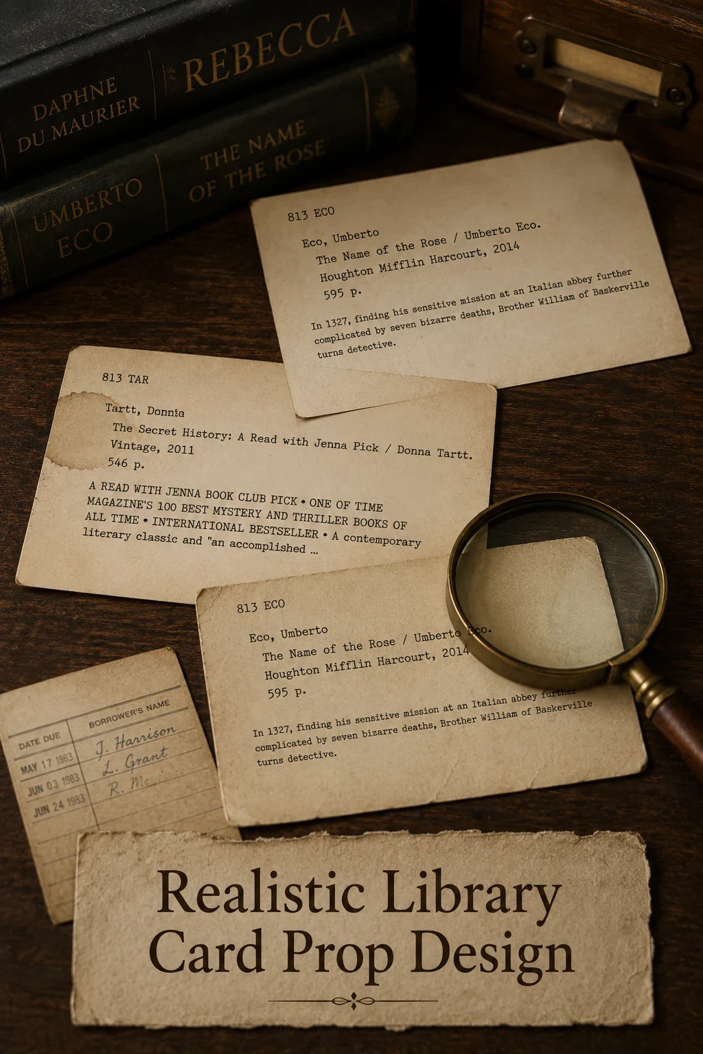
A library card might be on screen for two seconds, but if it looks wrong, the audience notices. A realistic library card prop has to survive both a wide shot and an extreme close-up, and it has to do so in the era the story takes place. The good news is that a believable prop card is far easier to produce than most period documents - if you get the small details right.
Start With the Era
Library cards have changed visibly across decades. Before you choose a font, pick a year. Some quick markers:
- Pre-1940s: handwritten on stiff buff or cream stock, no preprinted grid
- 1940s-1960s: typewriter text, faint preprinted lines, deposit grid
- 1970s-1980s: machine-printed labels, due-date stamps, cleaner type
- Modern (post-2000): barcode label, plastic ID card, no handwritten fields
Pick one and commit. Mixing eras is the fastest way to break the illusion.
Typography and Layout
For mid-20th century cards, monospaced typewriter fonts read instantly as "library card." Avoid modern condensed sans-serifs - they read as fake even when nobody can put their finger on why. For older cards, hand-lettering with a fine fountain pen on plain stock often reads more authentically than any printed font.
Aging the Card
A clean white card never looks right on screen. Three layers of aging will get you most of the way there:
- Dab strong tea or coffee across the card with a soft cloth and let it dry under a heavy book
- Lightly sand the edges and corners with fine-grit paper
- Add a worn fingerprint smudge along the bottom edge using a pencil
Do this after printing. Aging before the print run will smudge the ink.
Stamps and Marks
A due-date column is the single most recognizable element of a library card. For a period look, use a hand stamp with red or purple ink and overlap a few dates so the card looks used. Vary the angle on each stamp - real librarians did not stamp perfectly straight every time.
Quantity Printing
A scene that fills a card catalog drawer needs hundreds of cards. The trick is to make ten distinct designs and duplicate each many times. From a foot away, the eye reads "lots of unique cards" instead of "ten cards repeated." A free realistic library card prop generator gives you a fast way to produce those ten templates without designing each from scratch.
Common Mistakes to Avoid
A few details break realism faster than anything else: bright white paper, perfect type alignment, modern fonts, and barcodes on pre-1990 cards. If you watch a screen test and the card looks "too clean," it almost certainly is. A little extra age, a little less alignment, and the prop reads as real.
Helpful supplies for printable catalog cards
Some links on this page are affiliate links. If you purchase through them, we may earn a small commission at no extra cost to you.
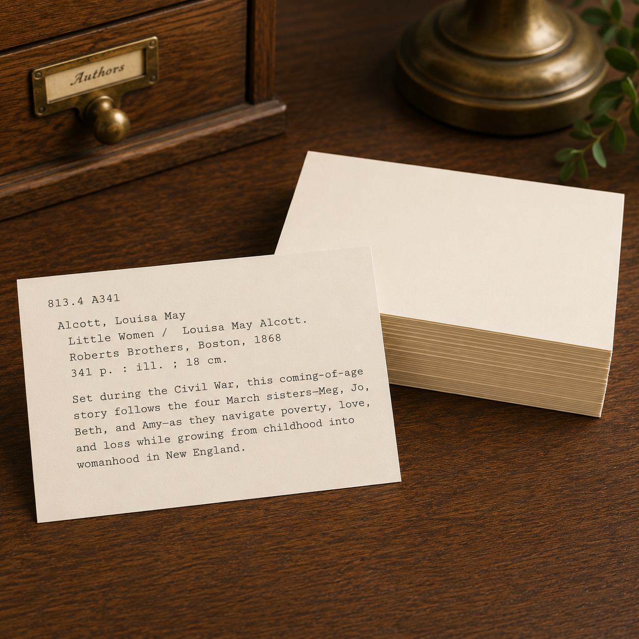
Heavy blank cards for printing catalog cards with a warm vintage look.

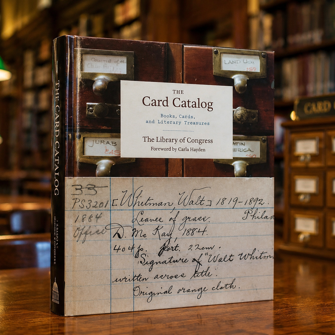
A handsome Library of Congress book for anyone who loves catalog cards.
Build a believable prop
Generate a realistic library card prop ready to age, stamp, and shoot.
Open the generator